A comic page is a map. Readers should always know where to look next without thinking about it. Good layouts do that quietly, which is why the best ones feel invisible.
Know the reading path
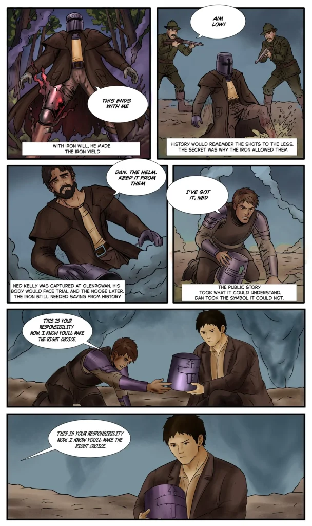
In Western comics the eye travels left to right, top to bottom. Arrange panels, speech bubbles and character gazes so they follow that path, and avoid placing a key bubble where it can be read out of order.

Vary panel size with purpose
- Large panels for establishing shots and big moments
- Small panels for quick beats and reactions
- Tall, narrow panels for falling, climbing or rising tension
- One splash page per chapter, saved for the biggest reveal
Use gutters as a volume knob
Wide gutters create a pause. Thin gutters speed things up. Breaking a panel out of its border can make a character feel like they are leaping into the reader’s space.
We lay out and draw full comic pages for creators and brands. Share your script and we will propose thumbnail layouts first.
Ready to start your project? We reply within 24 hours.